As the energy market grows more complex, Zonneplan simplifies. While rules shift and costs rise, Zonneplan empowers people to take control, automatically and effortlessly. With smart technology that generates, stores and sells energy at the right moment, Zonneplan gives users peace of mind, not just power.
We repositioned Zonneplan from a technical energy provider to a human centric brand, one that reflects intelligence, clarity and optimism. A brand that speaks to a smarter, more effortless way of living. Not just about saving money, but about creating space for what matters.
The logo remains untouched, but its context is redefined. Through thoughtful application, a refined color system, and a unified brand language, Zonneplan now projects not only trust, but momentum.
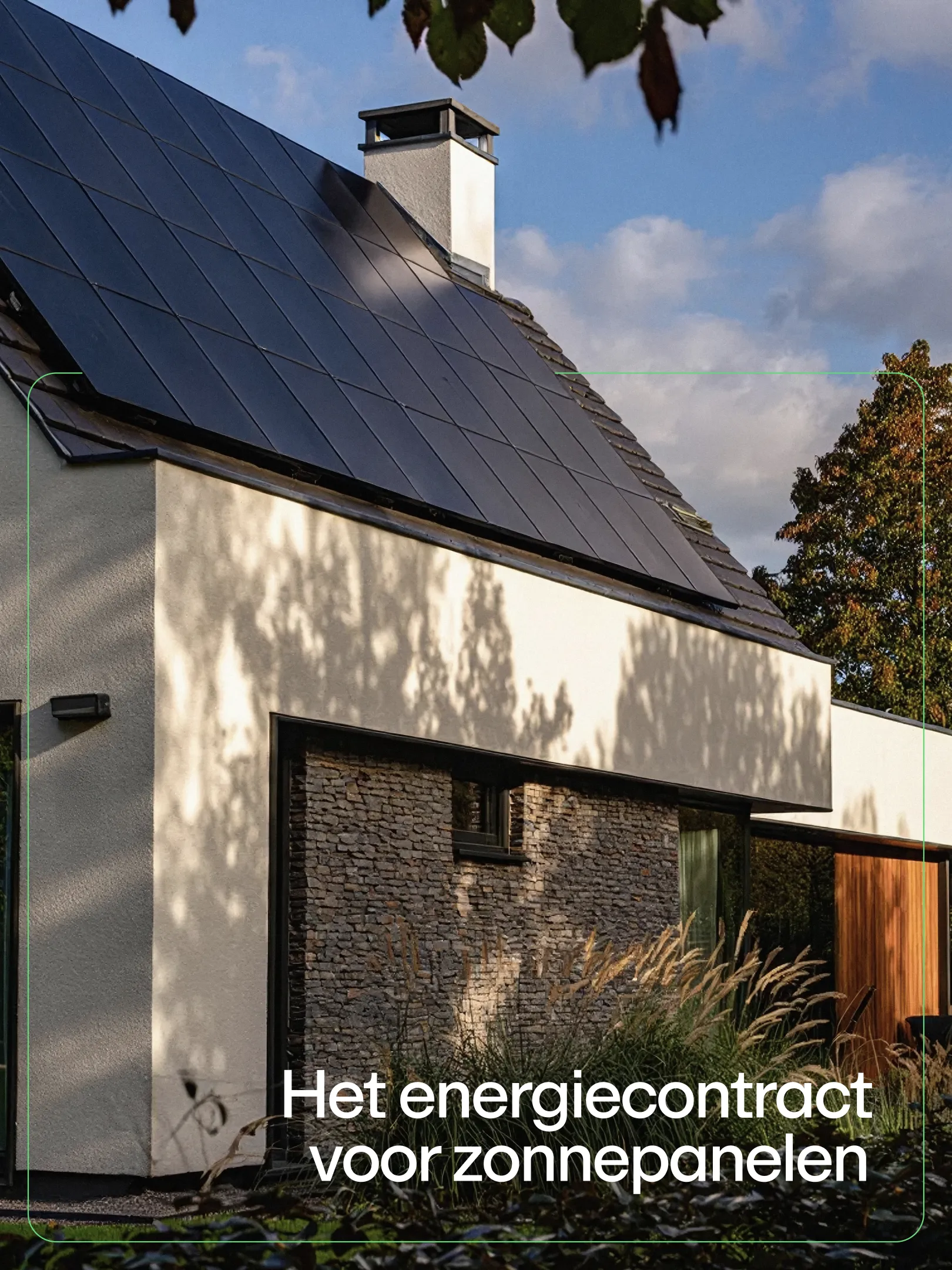
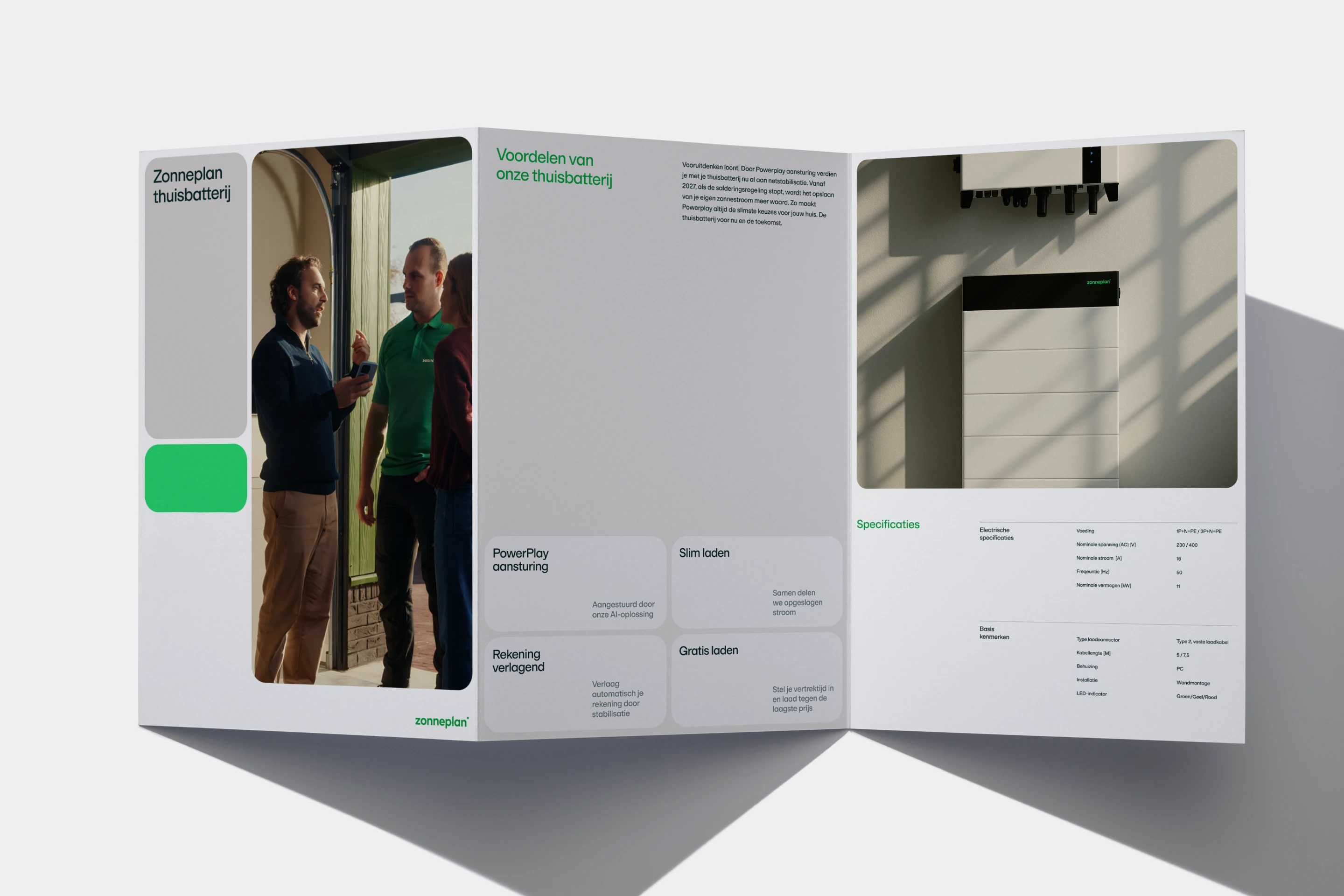
The visual identity mirrors the brand promise: light, calm and forward-looking. A color refresh introduces a bright green that signals innovation and optimism, carefully balanced with warm neutral tones to bring clarity and structure. The typography is minimal and friendly, with subtle technological nuances that lend a refined yet approachable feel.
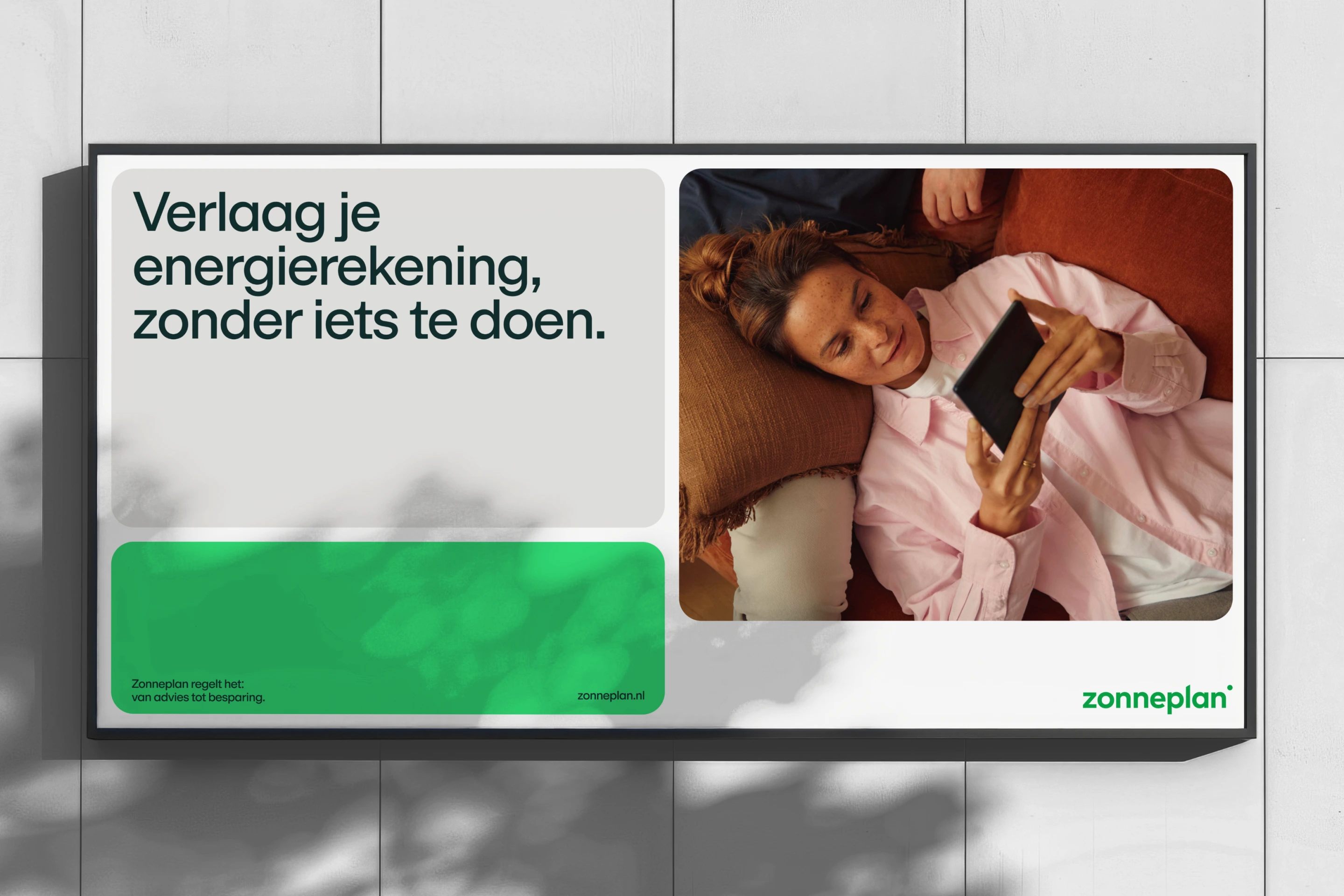
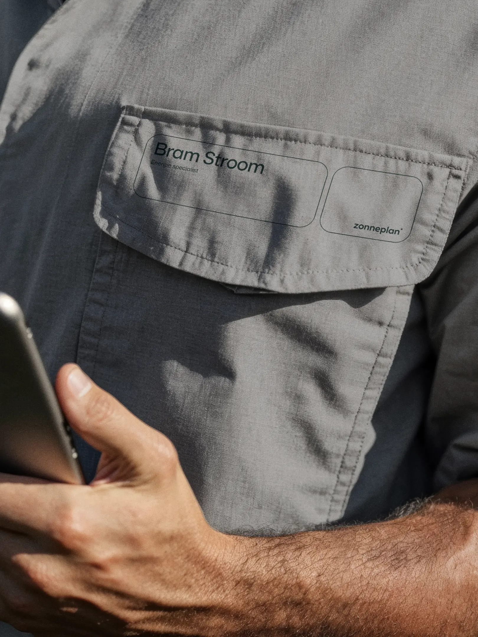
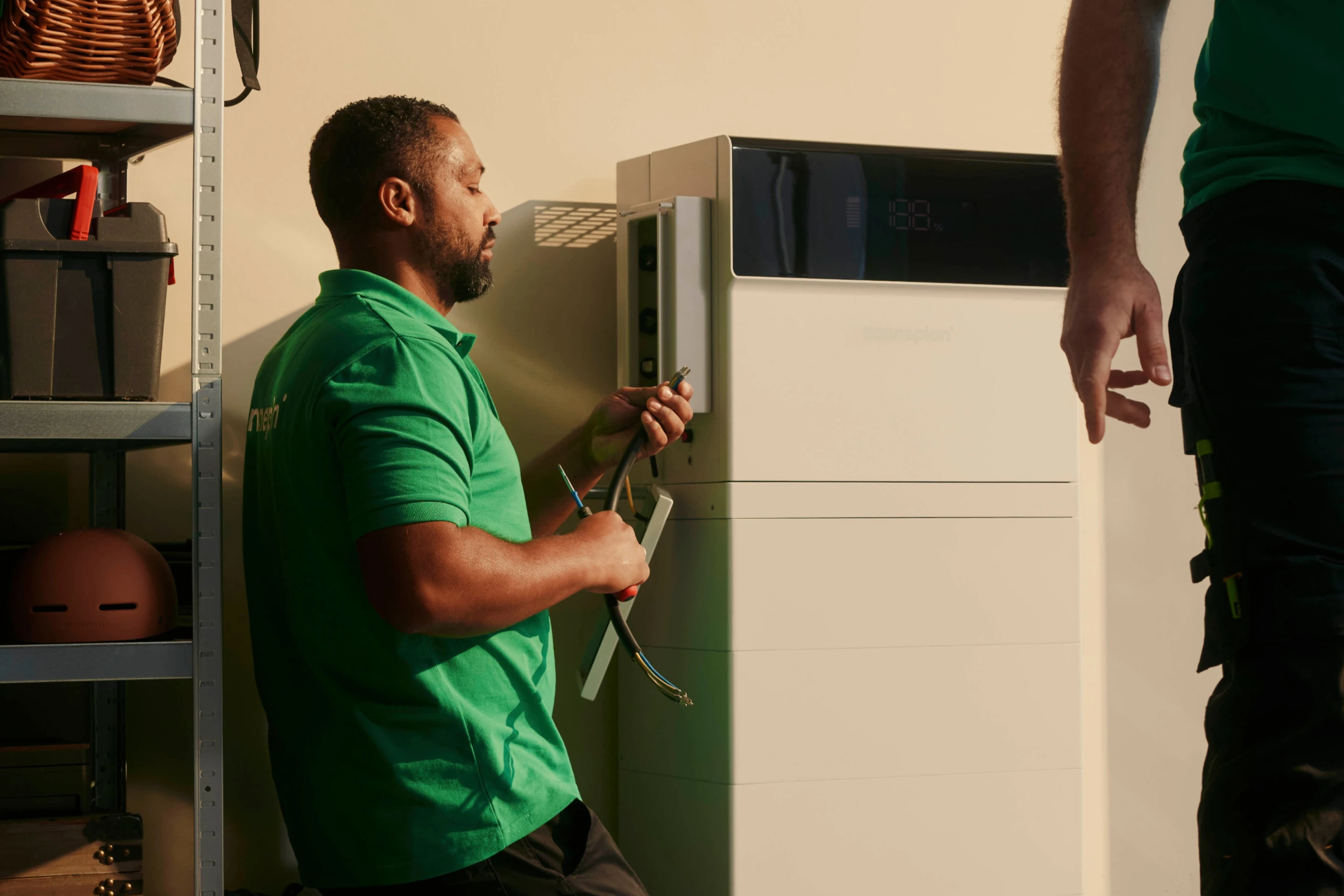
We designed a dynamic home grid system inspired by rounded, modular forms, creating visual consistency across both expressive and functional contexts. Photography captures the ease of everyday moments: natural light, soft shadows, and the quiet confidence of systems that just work. It’s a brand experience that feels effortless, yet distinctly intelligent.